Welcome to Enlite Prime
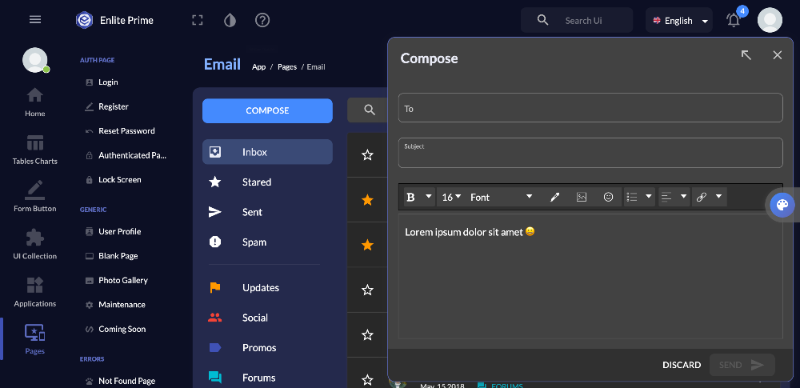
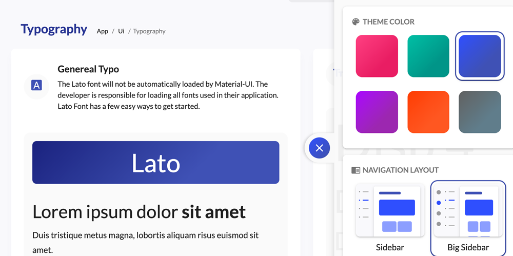
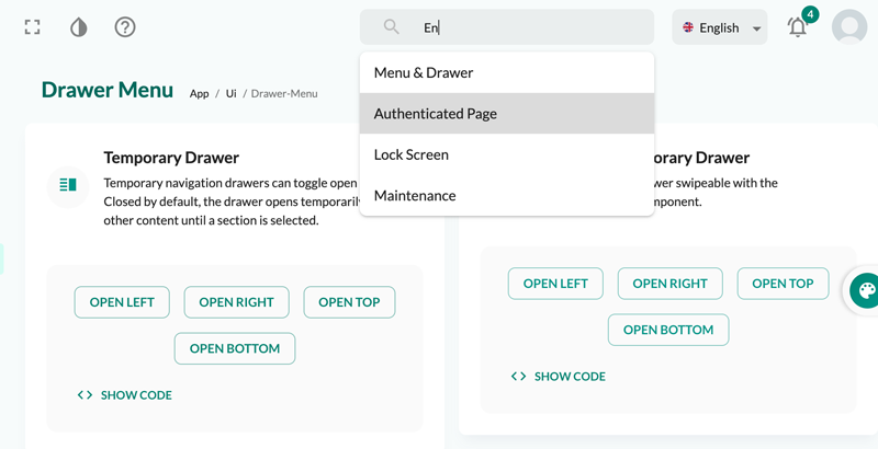
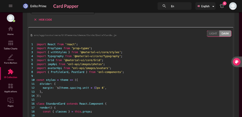
Here is some guide to use this template. Click next to continue and back to previous or click on outside to skip it.
The tooltips are text labels that appear when the user hovers over, focuses on, or touches an element.
descriptionsrc/app/containers/UiElements/demos/PopoverTooltip/SimpleTooltips.js
The Tooltip has 12 placements choice. They don’t have directional arrows; instead, they rely on motion emanating from the source to convey direction.
descriptionsrc/app/containers/UiElements/demos/PopoverTooltip/PositionedTooltips.js
You can define the types of events that cause a tooltip to show.
descriptionsrc/app/containers/UiElements/demos/PopoverTooltip/TriggersTooltips.js
A delay in showing or hiding the tooltip can be added also.
descriptionsrc/app/containers/UiElements/demos/PopoverTooltip/DelayTooltips.js
A Popover can be used to display some content on top of another.
descriptionsrc/app/containers/UiElements/demos/PopoverTooltip/SimplePopover.js
Use the radio buttons to adjust the anchorOrigin and transformOrigin positions. You can also set the anchorReference to anchorPosition or anchorEl.
1
2<Popover
3  anchorOrigin={{
4    vertical: 'top',
5    horizontal: 'left',
6  }}
7  transformOrigin={{
8    vertical: 'top',
9    horizontal: 'left',
10  }}
11>
12  The content of the Popover.
13</Popover>
14
descriptionsrc/app/containers/UiElements/demos/PopoverTooltip/PopoverPlayground.js
 Buy Now


Here is some guide to use this template. Click next to continue and back to previous or click on outside to skip it.